MAGAZINE ANALYSIS
FANGORIA
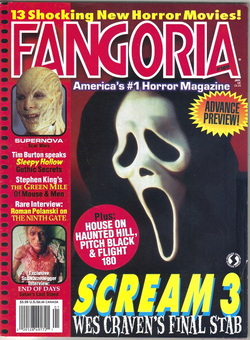
This is an unusual horror magazine as its base colour is pink throughout the whole magazine. However the content seems to be a typical horror magazine. The figure of scream is iconic in horror and is in the centre of the magazine, from this you can instantly infer that this magazine has something to do with horror as everyone can recognise the mask. The title of "Fangoria" is also pink and does not have a good horror font, for example the title of our film "Restricted" is coloured with red and uses a good font, as we researched many different posters and used them to match this way. However I don't believe that this is a good magazine to model. G.S
SHOCK HORROR
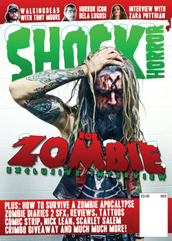
This is a one of the leading horror magazines, 'Shock Horror'. Therefore it should provide other magazines with the basis of what they should follow. Even though this is the christmas edition, they still manage to make it have a "horror" feel to it. They do this by the font of the title, this style of writing is slightly creepy and always mentioned with horror. Also the image within the magazine, this image may not be iconic horror like the last magazine with the scream mask, however it reflects a horror feel as it has a heavily made up character with the word "zombie" underneath him. This provides the reader with the knowledge that this is a horror magazine. The magazine makes the word "zombie" stand out as they make it much bigger and in a red font. Even though this has not much to do with an actual zombie as its an exclusive interview, at first glance it grabs the readers attention and instantly makes them think "horror". G.S
NIGHTMARE MAGAZINE
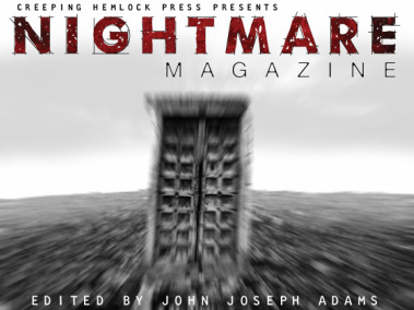
This magazine cover only uses some of the conventional horror colours however has used edits a lot more than most magazines. It looks like a magazine that concentrates on the paranormal side of horror instead of the gore or zombie. The title 'NIGHTMARE' shows it to be a creepy magazine that will leave the audience constantly thinking about what they read. The image makes the audience uncertain of what it actually is, leaving them wanting to buy the magazine in order to find out what it is and how it is relevant to horror. J.E
SCREAM
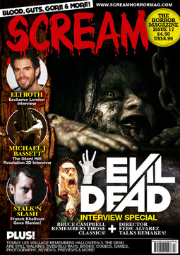
Like a typical horror magazine the main basis image on the front cover is a horror film character to show horror but also advertise a film, by doing this the audience automatically realise its a horror magazine from first glance. Adding to this the title being bold and red promotes horror as it has a dripping blood effect and the conventional red colour further showing the audience the contents of the magazine. The word 'Scream' connects to a horror feel persuading the audience what sort of magazine this is. The tag line 'Blood, Guts, Gore and More' covers the main aspect of horror with death and killing but then also the 'more' leaves the audience questioning what more is inside. J.B
SCREAM
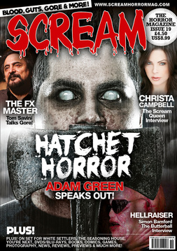
This is another 'SCREAM' magazine, it carries on using the skilful title of the magazine which indicates to the audience that it is a horror magazine as the word 'scream' is usually what a victim in horror does whilst isolated and in need of help. Following on from this it uses the same dripping blood effect and conventional red colour to help promote to the audience that feeling of horror. Like any other horror magazine it uses a large iconic horror image to catch the attention of the viewer, in this magazine it uses a normal looking male character but with no pupils and very pale skin, this image usually indicates the character to be under possession or in a zombie type state. The dull grey skies behind the character are also effective in promoting a possessed and horror sate. The axe used on the magazine cover has always been known as an iconic prop in horror and usually associated with brutal and gory murders. So when the audience notice the Axe then they automatically think of horror. The font throughout the cover of this magazine is associated with blood and has scratchy and bold characteristics which is much more horror based than the typical smart fonts. J.B
PARACINEMA
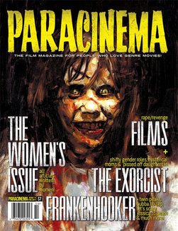
From this magazine it is clear that the genre on the magazine is horror due to the controlling image. A horror audience would recognise this character from 'The Exorcist' film. With help of the colour scheme this magazine tries to concentrate on the possession and paranormal side of horror rather than the traditional zombie and gore. To create the paranormal feel the colour of the tittle skilfully matches the colour of the eyes of the possessed girl, this shows the audience the main indication of the magazine revolves around this possessed feeling. Following from this the completely black background helps to make the character stand out to the audience so its the first thing they notice whilst viewing the magazine. Unlike most magazine covers the front isn't covered with other titles and pictures to further promote the iconic image on the front on the magazine. J.B
EMPIRE
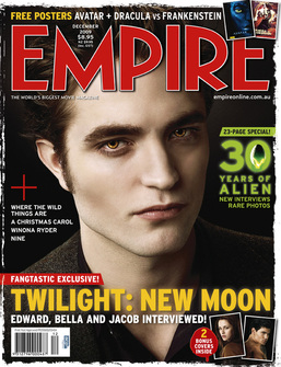
This magazine uses the conventional horror colours of black and red. From the image, it is clear that the sub-genre is a vampire/zombie film and the is a male protagonist that is a vampire. The two pictures at the bottom suggest there could be a love triangle between the two males and the female, which could be the storyline of the film. The plain, black background shows it could be quite a dark film yet the film will be focused on the characters. J.E
