MOVIE POSTERS
Halloween
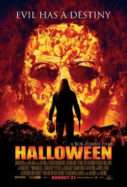
An effective part to this poster is the amount that is thrown into the image, with a lot of people and faces in the background. The more that you look into the poster, the more that you seem to find. We think it is clever how all the small pictures of people come together and make the big face. Also it is effective how they have really put a lot of attention to the man in the middle and the fact he is dark shows he is mysterious. They make this character as a shadow because it stands out to the audience and makes them realise he is an important figure. The use of the colours red, orange and black also sends out the sense of danger and warning which give the viewer a good take of what happens in the story. S.T
Scream 4
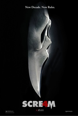
What we liked about this poster is how the mask is mixed together with the knife. This shows to us that the knife is a significant part to the masked killer and shows it to be a classic icon to horror. It shows us that the we will know the killer as wearing a mask and to use a knife as its weapon, this shows us we might not find out who the killer is but we do know it will be a gory horror. We know this because knifes are related to blood and killing so we know it will be brutal killing. The black background makes it effective as it highlights the mask and the knife so people concentrate on it and know the genre of the film and then start to create a story in there own mind. The 'New Decade, New Rules' quote shows the audience that it will be different to the other existing 'Scream' movies to regain their audience. J.B
Chernobyl Diaries
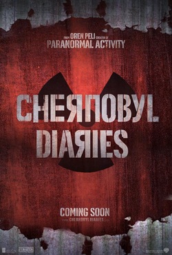
We believe that this poster is pretty plain and does not reveal much about the film. However we believe it could if with our film as it has the nuclear waste sign in the background. this could hint as to a sort of illness or pandemic in this film. It already lets us know what will be the killer or the main theme that will go along with this film. This poster also doesn't have a tag line therefore it does not fit the usual trend of horror films. the font is also makes the lettering look as if it is in Russian. this gives a feel as to where the film is set. therefore even though this poster appears quite basic, it reveals a lot more information when you look into it. As there is a lack of detail and imagery in the poster, it skilfully uses the main horror colours to create the horror feeling within the poster. G.S, J.B
The Devil Inside
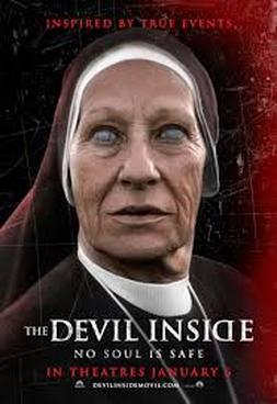
This poster uses the conventional horror colours of red, black and white. They also use a nun in the poster to show there will be a religious feel to it, which could lead one to believe that either the devil will be mentioned or an exorcism will take place. The background of the poster is black, making the nun stick out. This means she could be a main character in the film or there could be a group of nuns involved. The tagline says 'NO SOUL IS SAFE' which indicates that the sub-genre of the film is paranormal. It also says 'INSPIRED BY TRUE EVENTS' which definitely adds a more sinister feeling and will play with the audiences mind whilst they are watching the films. The use of tag-lines in this poster are very effective as they give subtle hints as to what the film is about, however it also makes them still anxious about the main features of the film. J.E
Citadel
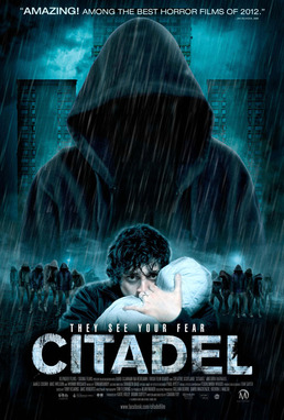
The main imagine in this picture is the infected looking down on the main actor, this shows us that the character is vulnerable in comparison to the infected and we start to doubt wether he can survive. It uses classic dark colours to make a eerie feeling within the poster for the audience. The hoods on the infected characters following by the smoke in the background helps to creates a mysterious feel which makes the audience question what the plot of the film is. It also contributes to the feel of horror within the poster. The title is clear and stands out on the black background which is eye catching for viewers. 'they see your hear' is effective because they are just known as 'they' and we don't actually know what they are, and the fear grasps the horror concept in the film. J.B
World War Z
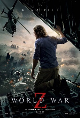
This poster is effective because it doesn't focus on the horror aspect of the film, instead it leaves whatever is causing the havoc in the poster is left to the audiences imagination. This is effective because people start to question what is causing what we can see in the poster and then want to go and see it to find out. This creates a mysterious feel because a city is under attack and we cant see what's causing it. The destruction of the city is effective because it shows the audience that its wide spread and has the attention of the whole world. The title is small but the large red z is effective, this is because it creates a horror and gore feeling so people start to create a image in their head of what's going to happen within the film. J.B
The Conjuring
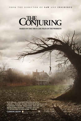
This poster is effective because it skillfully leaves the plot to the imagination of the audience, all the audience know is that it involves death which is indicated by the noose on the tree and that the plot could be evolved around a isolated house. The old house which looks abandoned surrounded by mist creates the horror feeling in the poster. Following this skillfully used is a shadow on the floor of the poster which looks to us like somebody being hung in the noose yet on the poster there is no person visible hanging, this could tell the audience there's a theme of paranormal and mystery in the film. Adding to this paranormal films are not typically based around blood and gore like other sub genre's therefore the use of just black and white in the poster without red further promotes a paranormal feel. The tagline underneath creates the feeling that this will be based on true events. This makes the audience wants to go and see the film and maybe even research this after to see if these events are true. Therefore this effectively uses the tagline to their advantage to boost viewership. J.B&G.S
Past Coursework Evaluations
ANNIKA
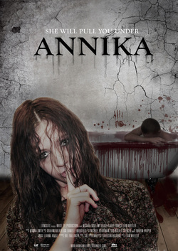
I feel this poster is effective as it tells the viewer a good view of the story just by the pictures. For example the two main characters are present both in a negative way which could show a bad relationship between the two. Also the amount of blood coming form the bath symbolises a lot of death.
Also this poster sends to us a lot of themes, such as secrets. The women holding him finger to her lips tells us something should be kept a secret. The text of this poster also gives a theme of the film being dirty; the text looks old and is leaking which looks effective. The poster all together looks uncomfortable and rememberable which makes an effective poster.
S.T
