In what ways does your media product use , develop or challenge forms of conventions of real media products?
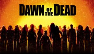
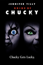
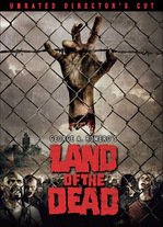
First of all we decided to choose Universal for our distributor, this was because it is one of the most successful and recognised film distribution companies of all time and helped to make many horror films such a success such as 'Land Of The Dead' 2005, 'Dawn Of The Dead' 2004 and 'Bride Of Chucky' 1998. We didn't design our own as we wanted to create our own production company but then work with a real distributor to market our product as we feel this would be the best way in which to gain the largest percentage of our target audience.
|
|
MAGAZINE COVER AND POSTER
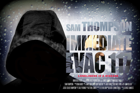
Our poster uses classic horror conventions used by media products by using our monster/mutant as the main image of the poster. This instantly portrays to the audience what the film revolves around and what our characters are going to be dealing with. It mirrors such posters as 'Citadel' and 'Scream 4'.
Following this our poster develops classic horror conventions mainly by using a more blue and black colour scheme in our poster to help us create that feeling of darkness and loneliness within our poster whereas in already existing horror posters you are more likely to find a more consistent red and black colour scheme as red and black are closely related to darkness and danger.
Finally our poster challenges classic horror conventions by using a font in which you wouldn't usually associate with horror. We did this because the font stands out and sets us apart other horror posters. Typical horror fonts would be more edgy and untidy with a red or dull colour scheme.
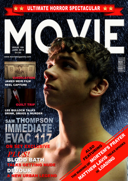
Our magazine cover uses classic forms of conventions from real media products by using the typical horror colours to regain our horror feeling in comparison to other magazines of a different genre or product. We cover the the magazine cover with red banners and titles as its eye catching and helps the audience to understand the genre of our mag. Following this is also binds well with the blood on our knife image.
The way in which our magazine cover develops classic horror conventions of real media products is by using a more simple but effective font that you would usually see on non horror magazines. We did this because we are still getting our sense of horror from the colour red therefore changing the font allows us to make our magazine stand out more as it looks different and more effective than typical horror magazines such as 'Shock Horror' and 'Scream' whilst making it very easy to read.
Finally our magazine cover challenges classic horror conventions of real media products as it gives a very vague title which doesn't necessarily portray the genre. We believe this is effective because it opens up a wider range of audience as 'Movie' could imply a very vast range of films and then by skilfully using our colour scheme and layout we hint to our audience the genre of the magazine but with a larger range of films that your typical horror magazine.
TRAILER
In what ways does your media product use forms of conventions of real media products?
To begin the first way in which our media product uses a convention of real media products is by using fast paced shots that gradually builds up towards the end of a trailer. This is a common feature within real horror trailers as it creates tension and is effective in the way of creating excitement within the audience. Following this it couples well with the revealing of the title of the film at the end of the trailer to keep the audience intrigued. Along with this it also allows our group to give a short summary of the narrative without giving away too much of the plot to leave the audience guessing what to expect from the film. This idea we have used is similar to films such as 'World War Z' trailer from 1:50 onward and also 'State Of Emergency' from 1:42 onward. By mirroring effects already used it can help up to understand what is needed to create a successful trailer for our film.
|
|
|
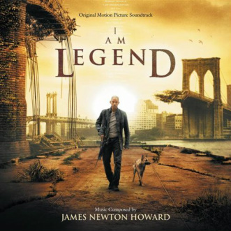
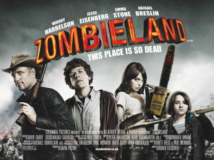
We followed and used the classic media conventions in our trailer by reflecting the main characters dialogue throughout, we did this to give the audience more understanding of what is happening throughout the trailer whilst still creating the atmosphere, both exciting and scary. Our main inspiration 'I Am Legend' influenced this idea as the trailer consists of the main character stating the plot of the film through the use of his own voice to help the audience gain an insight to what is in store for them. Following this the zombie based film 'Zombieland' also influenced us as it has a very similar idea used in the film itself.
|
|
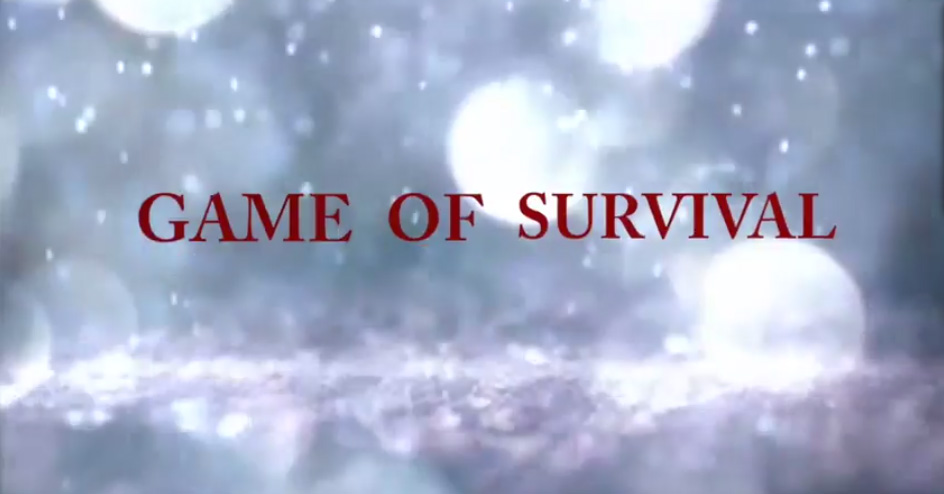
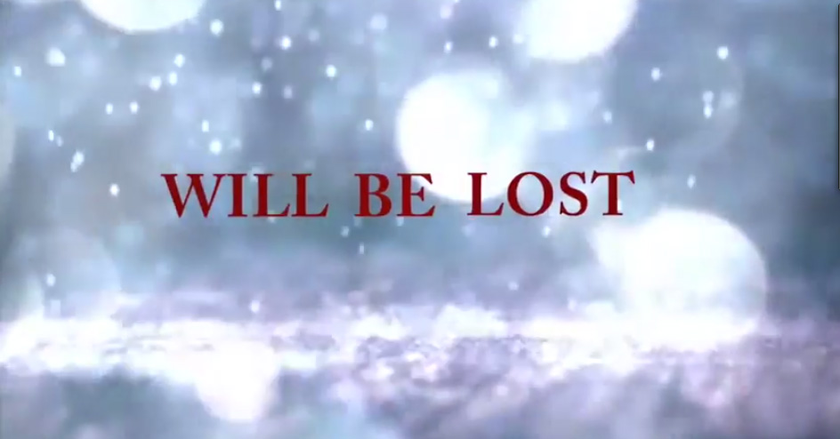
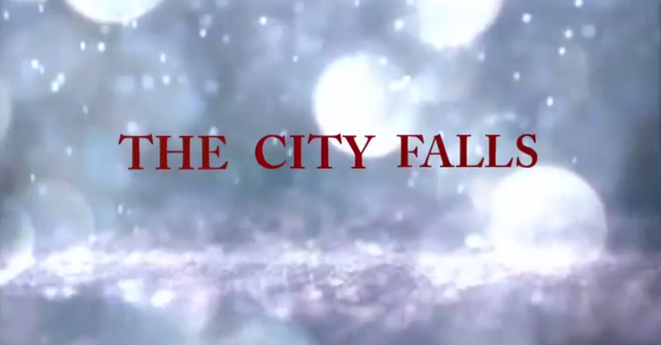
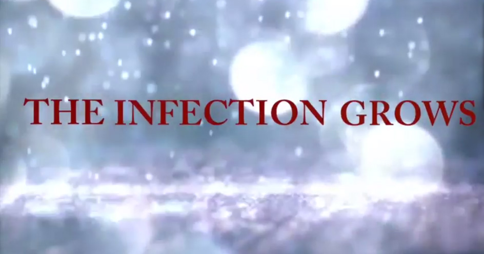
The final way in which our horror trailer used the classic horror conventions is through the use of our titles within our trailer which appeared between moving shots. It helped us to produce an easier understanding to the background of the plot and helped us to create a sense of horror through classic horror language. We used classic horror like language such as ' Game Of Survival' because it tells the audience that our character is in danger and death is always near which gives an impression of exciting footage in the film. The following title is 'Will Be Lost', this is effective because it leaves the audience guessing what the outcome of the film will be and if everyone will survive or if the mutated people conquer in taking over man kind. Next we state 'The City Falls', this is also an effective horror title because the audience automatically assume destruction and disruption within a normal city which means something has gone terribly wrong. Finally 'The Infection Grows' is our last title which is our main one for exposing the plot of the film. To the audience it portrays that the infection unleashed will keep growing without a way of stopping it, this classic horror language helps us to make our trailer more thrilling as the audience start to gather a vague plot of the film which effectively makes them want to watch it.
|
|
|
|
In what ways does your media product challenge forms of conventions of real products?
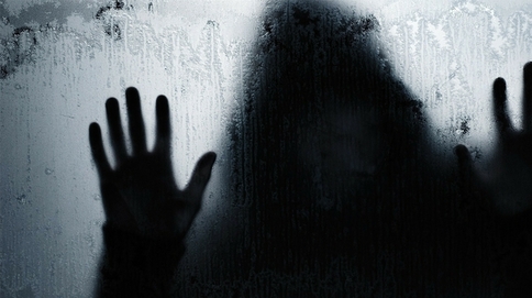
One of the ways in which our trailer challenges forms of conventions in real media products is by not revealing to the viewing audience what our monster/zombie character actually is. We skilfully do this by only giving the audience a slight indication by using our monster in only a few shots without giving the image away fully. The reason we decided to do this for our trailer was because it leaves our audience guessing after the trailer is finished which we believe is a skilful way to encourage them to watch our film. We believe it also adds an element of the unknown to our trailer which we think is considered a scary theme within horror films because the audience do not know what to expect. This idea makes us differ to the majority of real media products because real trailers clearly highlight the sub genre of the film in the preview whilst we aim to have our audience questioning what sub genre our trailer could be. This is similar to such films as 'I Am Legend' and 'Chernobyl Diaries'
|
|
|
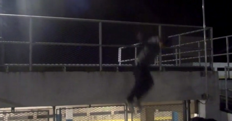
Another way in which our trailer challenges forms of conventions of real media products is through using almost a thriller type theme as a genre as well as our obvious horror, we do this through the use of our camera shots and the soundtrack. Firstly we promote our thriller type feeling through the use of our soundtrack. At the beginning we cater to the typical horror audience and use a relevant soundtrack to our slow horror shots whilst building up to the end. Following this we build into thriller/action music as our shots get quicker, our main objective of this was to cater to a larger audience as a thriller, action and horror audience can take an interest into our film. Also it gives our trailer and added sense of excitement which could leave our audience on the edge of their seats. Following on from this our thriller type theme is also reinforced through such shots as our main character jumping over the railing to the ground and the footstep running in the puddle. This is because shots like this are usually related to action which helps our trailer because more exciting and eye catching to our audience.
|
|
In what ways does your media product develop forms of conventions of real products?
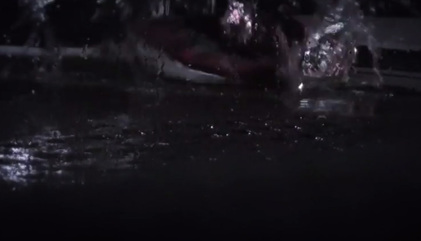
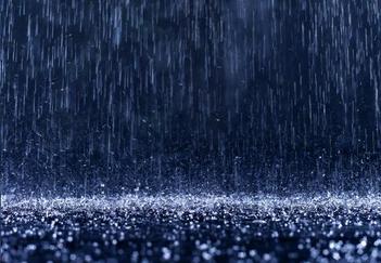
Towards the end of our trailer we begin to repeat water iconography to try and reinforce the theory of water being one of the most dangerous aspects to a horror film. We manage to gain this aspect by connoting "darkness" and "mystery" with the water in our shots. Behind our titles we created a rain waiter effect as it begins to develop water having a dangerous sense to it whilst accompanied by thunder and lightning to add the fear effect. Following this we also used it when our character was running into a puddle, this is because we believe it the water gives the shot more eye catching and appealing in comparison to a ordinary footstep.

|
|
The second way in which our media product develops forms of conventions of real media products is by using the classic zombie type theme but with a developed twist. Usually the conventional zombie character is a tongue in cheek unintelligent brain eating monster who's aim is to kill and devour of every human being left on the planet. We developed this theme and turned the zombie's into a more mysterious silhouette mutant character for our trailer. The first reason for this was without seeing blood and gore the audience cannot assume a typical zombie horror film and begin to wonder about the contents of the film and what these creatures are out to do and the characteristics of them. Secondly we revealed little amounts of our creature/monsters in our trailer as we believe it gives a greater potential of scaring and surprising our audience whilst viewing the film as they are unsure what to expect. We believe this development will be effective because it emphasizes the sense of mystery within our characters before our audience can just categorize it into a typical zombie film such as 'Resident Evil Extinction' and 'Day Of The Dead'.
|
|
|
